When to buy and sell in Forex trading
Timing for buying and selling not only Forex but also other trading securities such as stock or commodity is quite similar, which is “buy low sell high" (or sell high then buy low).
Use the chart that already reflect the changes in price movements to predict “buying low” and “selling high”. You can use the chart to forecast trading trend because it can provide a broad analysis.
Predicting when to buy and sell from the chart
Analyzing and forecasting when to trade using the chart is called “Technical Analysis".
It is the study of market action (movement of the prices) primarily through the use of charts for the purpose of forecasting.
There are many methods for technical analysis on Forex charts, but the five technical analysis methods below (moving average, bollinger bands, envelope, MACD, RSI) are commonly used by traders around the world.
Furthermore, indicators are shown in technical analysis.
This article will discuss in-depth these 5 types of indicators.
Moving Average
A moving average is a line that measures the average exchange rate over a given period of time and is a measure of market sentiment based on direction of market prices.
Forecasting the direction of market prices
- Moving average: Market price increases
- Moving average: Market price decreases
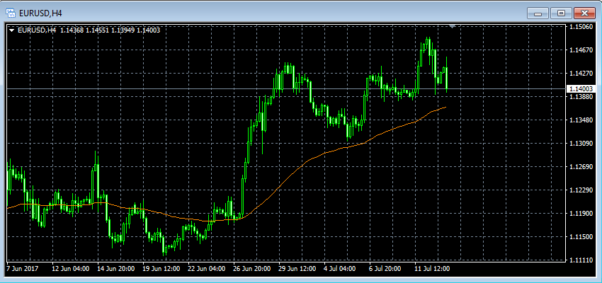
Sample chart on EUR/USD with a 4-hour time frame
The orange line in the chart above is the moving average.(colors can change)
The green line (candlestick chart) is the exchange rate chart. The far right side represents the most recent exchange rates, the far left side shows historical exchange rates.
In the example above, we see an orange moving average line going up midway.
This shows that the price tends to increase and you can make a big profit by placing a “Buy" order.
Conversely, if the market price falls, the probability of making a profit tends to be high if placing a"Sell" order.
Forecast trading at the intersection point between moving average lines
- Golden cross: Buying signal
- Dead cross: Selling signal
Golden cross forms when the short-term moving average rises above its the long-term moving average.
Dead cross forms when short-term moving average falls below its long-term moving average.
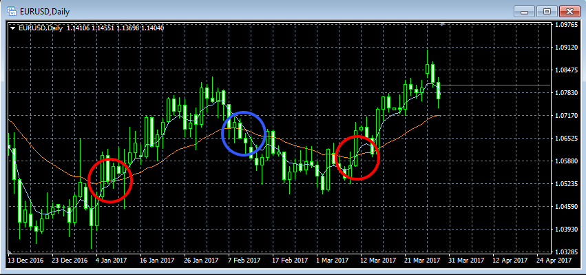
Sample chart USA/JPY
The red circled area in the sample chart above is the golden cross. Looking at the chart, we know the blue line rises above the orange line and they intersect.
At dead cross, the blue circled area, the blue line goes below the orange line and they intersect.
Sample cycle of moving average line
- Short-term moving average: 5, 8, 13,..
- Mid-term moving average: 21, 25、75,..
- Long-term moving average: 100, 200,..
The cycle of the moving average is not specified, but in trading it is usually associated with cycles as above.
For example, if the exponential moving average is “5EMA" then plot the constant multiplication graph over the average exchange rate of five candlesticks in the past. In case of day time frame, calculate the average exchange rate of 5 days, in case of 15-minute time frame, calculate the average exchange rate of 1 hour 15 minutes (15 minutes x 5 bars candle).
Bollinger Bands
The Bollinger Bands are indicators that apply statistical measure to the moving average, forecasting the transaction from the probability of fluctuations between the upper and lower bands.
About Probability of a Bollinger Bands
- Probability that price falls within “-1σ" ~ “+1σ" from the average price is 68.26%
- Probability that price falls within “-2σ" ~ “+2σ" from the average price is 95.44%
- Probability that price falls within “-3σ" ~ “+3σ" from the average price is 99.73%
σ = sigma
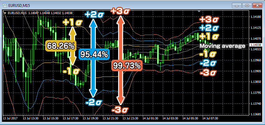
Example of displaying Bollinger Bands on the EUR/USD chart with the 15-minute time frame
The Bollinger Bands display ± 1σ (standard deviation 1), ± 2σ (second standard deviation), ± 3σ (third standard deviation) deviating respectively from the moving average line in the middle.
As shown in the chart above, the probability of having an exchange rate fall within ± 1σ, ± 2σ, ± 3σ is is determined at each deviation . Predicting the transaction would be based on this probability.
Forecast trading based on probability
- “Sell" if exchange rate rises to +2σ、+3σ
- “Buy" if exchange rate falls to -2σ、-3σ
The chart below is a sample trading where a sell order is placed at the blue circled area(+ 2σ, + 3σ) and and a buy order is placed at the red circled area (-2σ). Close the order if it falls within ± 1σ.
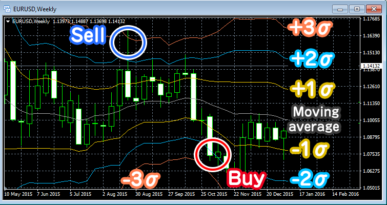
Example for buying and selling point of Bollinger Bands
For example, the probability that the current price is outside the “-2σ" or “-2σ" line of the Bollinger Bands, only 4.56% (because the probability that the price falls within “-2σ" “~" + 2σ “from the average is 95.44%), so you can predict any price in the deviation of ± 2σ.
Predicting the trading by expanding box market
- Will trade if the trend moves from the box market (the market price fluctuates within a certain range) and the range also expands.
Box market (Range market) is a market whose prices fluctuate within a certain range.
As the price falls out of the box market and the Bollinger Bands expands, you can predict the trading in the direction of volatility/span>.
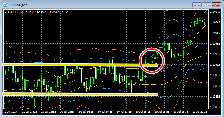
Sample chart that shows price rising above box market
In the chart above, price rises above box market and Bollinger Bands is expanding.
You can make a profit by placing a buy order at the red circled area.
Envelope
Envelope is a line deviating within a certain range above and below the moving average line.
Predicting a trade involves identifying trend of price changes within certain deviation range from the moving average line.
Predicting a trading activity where prices reach envelope
- “Sell" if the price reaches envelope’s upper band
- “Buy" if the price reaches envelope’s lower band
At the box market (envelope market) the envelope can be taken advantage of because the price changes within certain ranges from the moving average.
You can predict the trading and place a sell order when prices reach the upper envelope and place a buy order when prices reach the lower envelope.
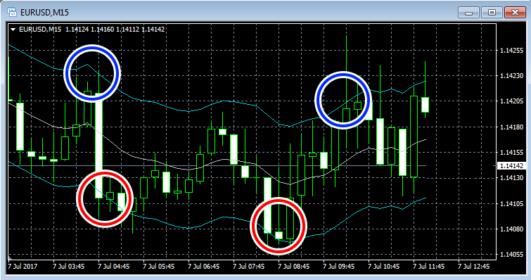
Sample chart that displays envelope in box market
In the example above, place a sell order at the blue circled area where the price reaches the upper band of the envelope and place a buy order at the red circled area where the price reaches the band of the envelope.
Placing an order in the reverse trend of the forex market is called “reversal pattern” Placing orders in the same direction as forex market is called “continuation pattern".
Envelope is basically trading in reversal direction.
Only effective at box market (range market)
Envelope can be effectively applied in the box market where the price fluctuates within a certain range, but it is not useful in the market where market volatility moves in a certain direction.
When the box market is broken, it is important to quickly cut loss.
MACD
The MACD is the difference between the two moving averages and an indicator to predict if the market price overlaps on the signal line on the chart.
MACD is an indicator analyzing volatility shown in the chart.
Predict price movement by taking 0 as the basis
The MACD is displayed by a line with the value “0". When two moving averages overlap, the MACD histogram reaches 0.
- MACD changes from negative to positive = Golden cross
- MACD changes from positive to negative = Golden cross
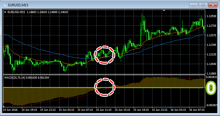
2 moving averages (shown above) and MACD (shown below).
Look at the chart above you will understand that the MACD will become zero at the red circled point where the two moving averages 25EMA (orange) and 75EMA (blue) intersect.
25 EMA will become the golden cross when it rises above the 75 EMA. MACD also changes from negative to positive.
The MACD red line is called a signal because the moving average is overlapping on the MACD.
- Place a “Buy" order when bar chart of MACD and signal lineboth change from negative to positive
- Place a “Sell" order when bar chart of MACD and signal lineboth change from positive to negative
Taking 0 as a value base, can you predict a trade if the MACD changes to positive or negative value?
Predict trading where MACD and signal line intersect
The timing of the intersection between the MACD and the signal line is considered as a factor to predict trading.
- “Buy" because it becomes a golden cross when the MACD intersects with the signal line from bottom up
- “Sell" because it becomes death cross when MACD intersects with the signal line from top down
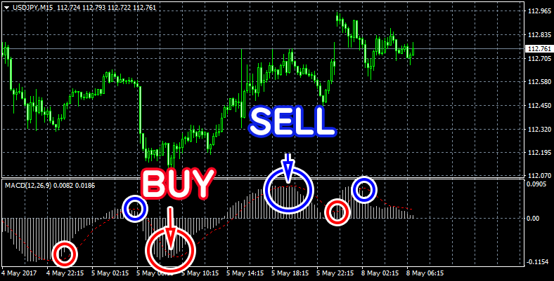
The example specifies the trading where the MACD and the signal line cross
After golden cross forms, if the MACD changes from the 0 to the positive value, the probability of price increase becomes high. Conversely, after dead cross forms, if the MACD changes from zero to negative, the probability of price drop becomes high.
The prediction that is combined with the zero-based transaction prediction like this is commonly used.
RSI
RSI is a technical indicator to decide overbought and oversold.
In the magnitude of price movements at a certain time period (commonly 14), the RSI measures price increase or decrease between 0% and 100%.
RSI is an oscillator indicator shown in the graph.
Predict a trend based on increased and decreased magnitude of price movements
- Over 70%, “Overbought"
- Below 30%, “Oversold"
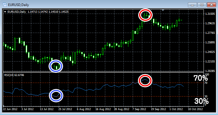
Example of RSI (shown in the chart)
is an profit indicator where a “Buy" order(blue circled area) is placed if oversold below 30% and a “Sell” order is placed (red circled area) if overbought above 70%.
The trading method based on increased or decreased deviation can be used effectively in the box market, but the disadvantage of it is that it is difficult to predict market volatility in one direction.
Therefore, RSI is an indicator that is often used together with other indicators.
Displaying the right indicators
As mentioned above, the list of indicators above is often used by investors around the world, but more importantly you need to use the right indicators with current market prices or currency pairs.
Daily exchange rates will vary, so use appropriate indicators to predict market trends at a specified period of time
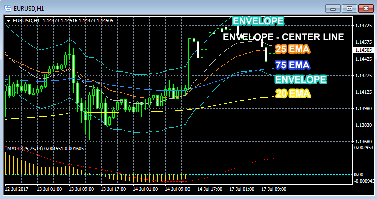
The sample chart shows 3 moving averages, envelope and MACD
When multiple indicators are shown on a chart, you will easily find the indicator matching with most recent exchange rate fluctuation..
Biểu đồ trên đang hiển thị 3 đường trung bình đông, envelope và MACD.
Prices will vary with the moving average and prices are usually in the envelope. Looking at the chart we also see the price increase at the time MACD changes from negative to positive.
Predict the trading trend using indicators that match the market price at that time.
It’s difficult to predict the market if too many indicators are displayed
Showing too many indicators on a chart also makes it difficult to predict a trade, so if you want to display more than one indicator, only four types of indicators should be displayed.
For beginners, there is often a tendency to display a lot of complex indicators, but for professional traders around the world, they often use a few simple indicators.
First, it’s a good idea to try trading with indicators from a demo account and practice to find the index that works for you.