How to view forex candlestick charts and how to use MT4 charts
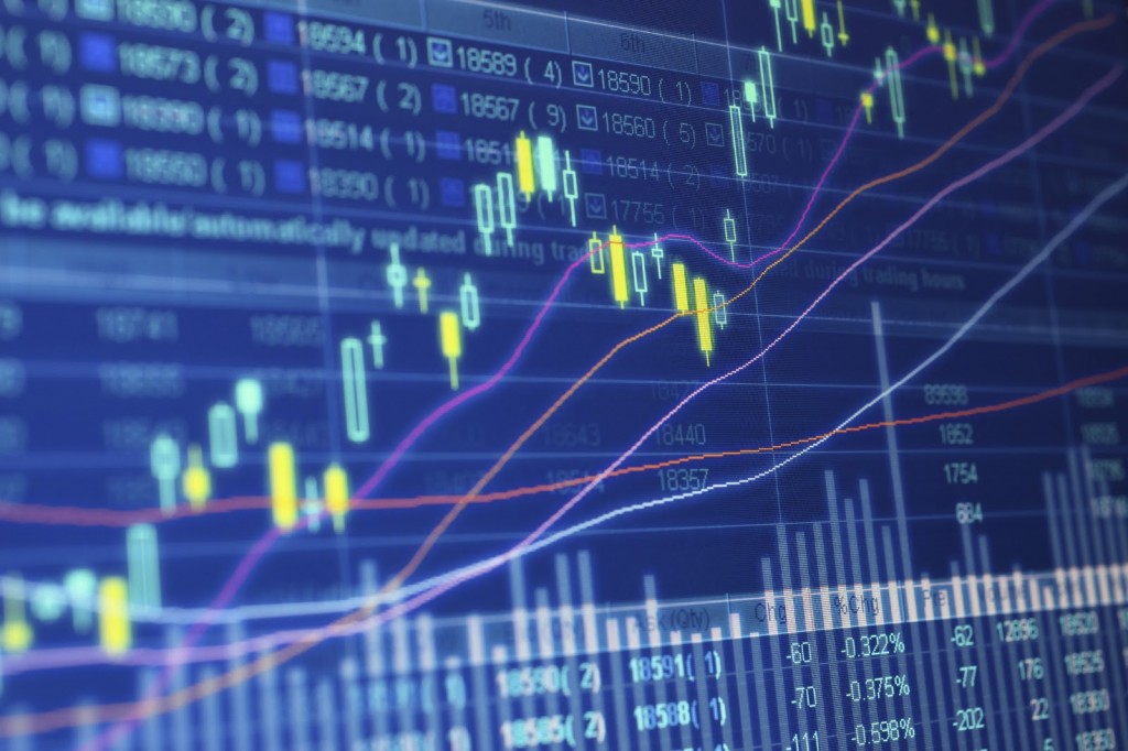
Reading FX charts can seem difficult, but it’s really simple. The FX graph shows the historical exchange rate chart from the present that can be easily viewed with visual .
The vertical axis is the exchange rate axis, the horizontal axis is the time axis (the bottom right corner is the current exchange rate).
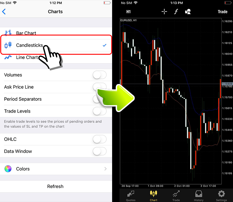
Display “candlestick chart"
There are three types of charts, “bar chart", “candlestick chart", “line chart" .
If it’s the MT4 smartphone version, choose “Settings" → “Chart".
If it is MT4 on PC, you can select from the “Right-click on the chart" → “Properties" → “General".
Among three kinds of display, “candlestick chart" is the easiest to analyze and commonly used around the world.
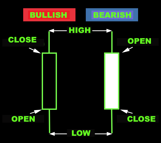
In the standard display mode, the blue graph is displayed. White bar means price is going down, bar passing white area means that price increases. You can change the color of the chart according to your own preferences.
How to view the candlestick chart
Each bar of the candlestick chart has different meanings. The line below the bullish line, the bearish line indicating “low price" is called the lower shadow. The line above indicating high price is called “higher shadow".
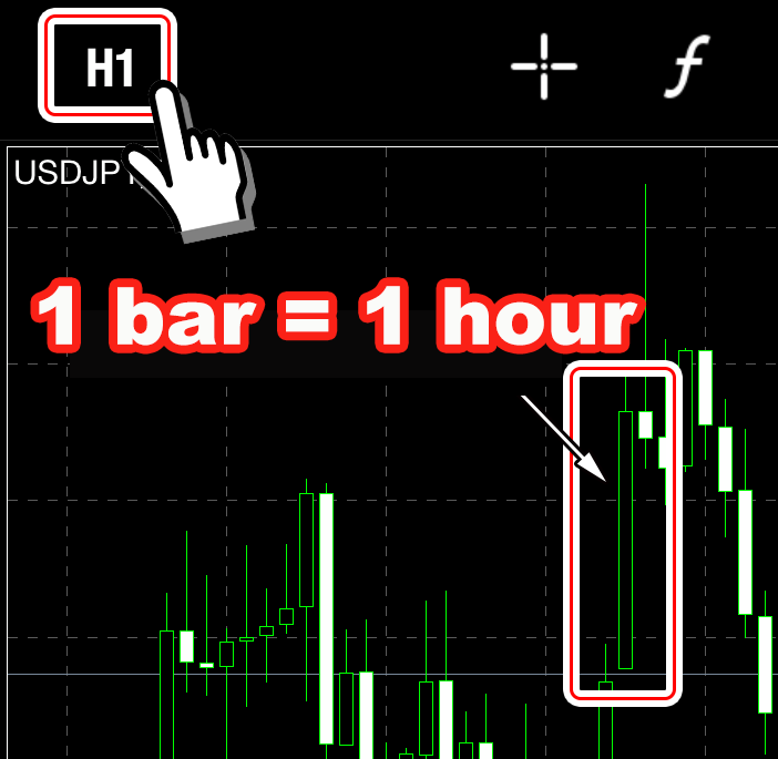
Each bar of the candlestick chart is the time set for display(Called time frame.)
For example, if you choose to display a 1 hour time frame, 1 bar=1 hour, 15 minute time frame, 1 bar=15 minutes.
Use candlestick chart analysis
By analyzing past chart combinations from the present you can apply FX trading.
There are many ways of analyzing the charts used by individual investors in the world, but the typical analysis is “Envelope"và “EMA".
Also, you can refer to the chart analysis (technical analysis) from the link below.